Responsive Images using adaptImages.js
The two images below look the same when seen in a browser with width greater than 640 pixels, but if you resize your browser or if you’re viewing this page on a device with a lesser width, you will notice that the second image is aware of it’s context and will show a version more appropriate for it’s size.
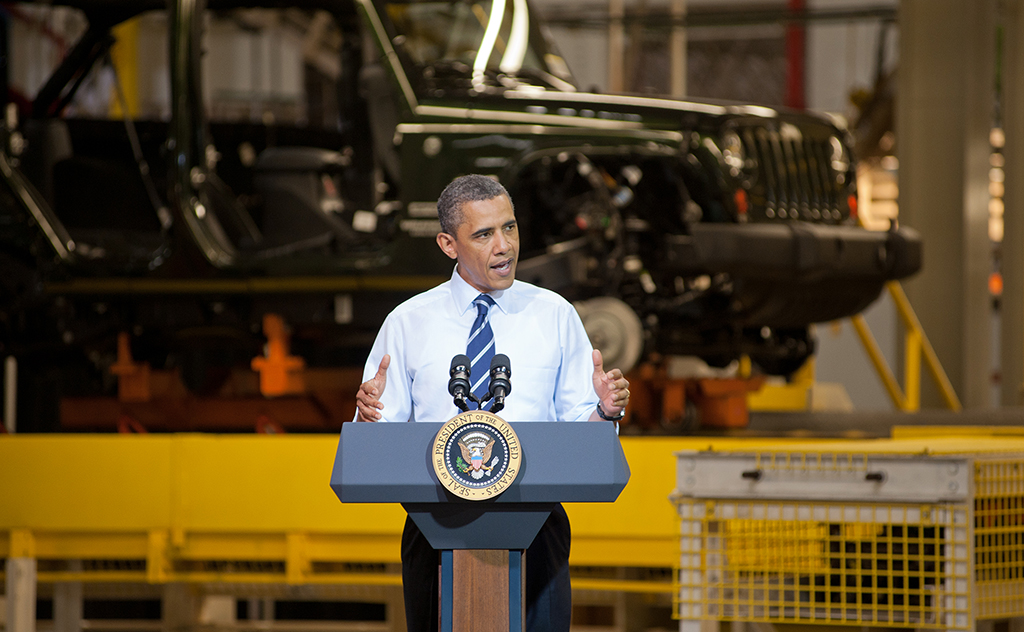
A plain old image
At small browser widths, when this image is simply scaled down, you can barely recognize Obama.
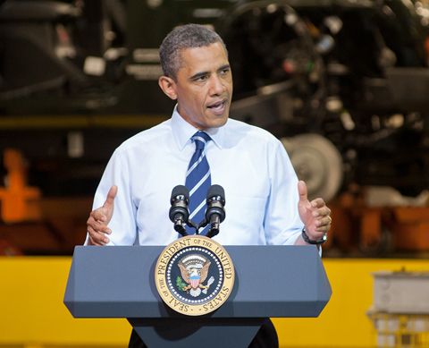
A responsive image that uses adaptImages.js
At small browser widths, a cropped version, more suited for that size is shown.
 Credits
I borrowed the idea of using this particular image from Jason Grigsby, his blog posts on responsive images are quite informative.
Photo of Obama licensed under Creative Commons. CC BY-NC-SA 2.0 from BarackObamaDotCom